User studies in campus navigation
Grinnell’s campus has seen many physical changes in the past year or so, including the new admissions building, the HSSC, movement of departments [1], new walls and gates, new signage, and a bunch of new wayfinding signs. This musing [2] is about the last issue.
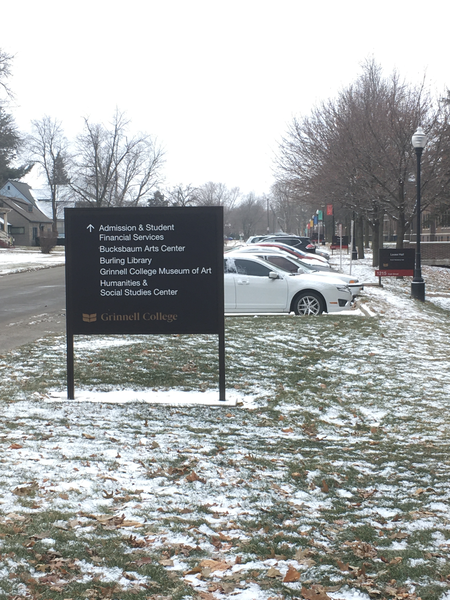
I love the idea of signs that help guide people through campus. But I have questions about the implementation. I know that if I were asked to make the signs, I would have made the arrows point in different directions. For example, there’s a big sign at the corner of 8th and East that seems to indicate that one should go south to reach the HSSC and Admissions [3]. I would have had the arrow point east. There’s a sign right after you cross 8th southward between the HSSC and Noyce that indicates that both are straight ahead. I would have said that Noyce was to the left (or diagonally to the left) and that the HSSC was diagonally to the right. There’s a sign at the intersection of the East-West path that runs south of the Forum and the North-South path that runs west of the Forum that seems to indicate that you should follow the diagonal path to get to Noyce, while I would tell someone to go straight ahead.
Part of the problem may be how you interpret signs. Does a left
arrow mean turn left right before this sign
or turn left after
this sign
? Or is it perhaps situational?
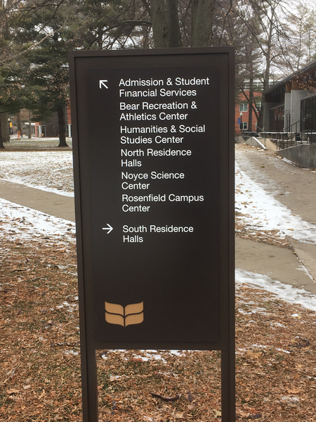
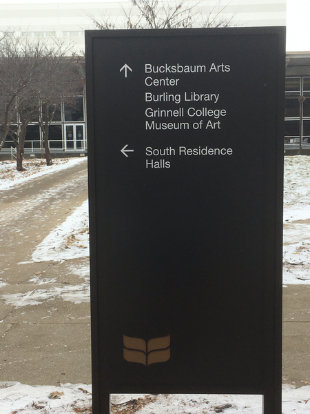
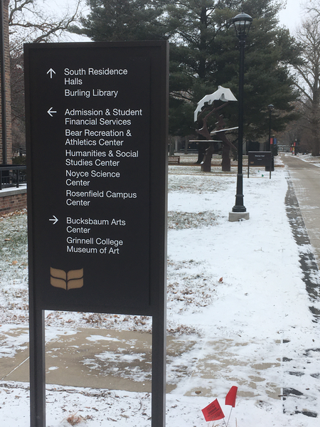
There’s also a question of which building names you put on which signs. I’m surprised that many signs indicate the direction to only one or two of the dorms, rather than all three.
In any case, I would have made very different signs [4]. However, it’s not clear that my signs would have been more useful. While there is, of course, clear evidence that I am a fount [5] of wisdom [6], it’s also the case that I think differently than others [7]. But I also know that others find the current signs confusing; I’m pretty sure that at least one colleague tried to follow signs to Noyce and decided that they make you circle the building.
So how do we determine what is best? I’d suggest user studies.
Pick some interesting tasks, such as Find Noyce from the corner
of 6th and Park
or Find the handicap entrance to Steiner from the
Forum parking lot
or Get a parking pass so that you can park
behind the Chrystal Center
or Visit the Grinnell Museum of Art
starting at the JRC [8]
. Then ask people to accomplish those tasks
using the signage and see where they get confused. Ideally, we’d
run the tests with different choices of directional signage and see
what works best.
I believe that when we designed the signage for the interior of Noyce, we used a form of crowdsourcing. That is, we put up paper signs with what we thought would be good directions and then asked people to correct and comment on those signs. Those who’ve tried to navigate Noyce know how well that worked [11,12,14].
Will we do something systematic to improve the signs, or will we just rely on gut instinct and a resolution to the occasional complaint? I would hope for the former but I expect the latter.
Postscript: While I think all of the tests would be valuable, I’d particularly like to challenge those who made the signs to navigate campus in a wheelchair, using only the signs, and find the accessible entrance to each building.
Wait a minute! Don’t we have a team of students on campus that’s supposed to assess the accessibility of buildings? They must have been consulted on the signage and how to address accessibility in that signage.
Are you done laughing yet? That’s not how we do things at Grinnell.
Back to reality. Let’s run the tests. Maybe we should add a time limit, too. And let’s consult the accessibility team.
Postscript: I am told that our accessibility leaders were consulted about
the font and the colors for the new signs, so that’s a start. I
am also told that folks listened when some accessibility folks on
campus said That sign is misleading about the accessible entrance.
I just wish that there was earlier conversation about placement and
other issues. At least it’s easy to change the signs [15].
Postscript: To my friend Adena Schutzberg, I say #GeographyIsEverywhere.
To my friend Janet Davis, I say #HCIisEssential. To my friend who
circled Noyce, trying to follow the signage, I say thank you. To
my colleagues in accessibility services, I say
#DiversityIncludesDisability
.

[1] For example, Analytics and Institutional Research moved to 1127 Park Street, Art History moved to Goodnow, and Careers, Life, and Service moved to the Chrystal Center.
[2] Rant?
[3] This example, and others, can be found at the end of the musing.
[4] I also would have placed some in different locations, but that’s another issue.
[5] Grammarly thinks I should use font
. It’s
wrong. At least it didn’t tell me to use typeface of wisdom
.
[6] That was intended as humorous. I’m arrogant but not that arrogant.
[7] Isn’t that one of Grinnell’s slogans.
[8] There’s a sign here that says
[9]Faulconer Art Gallery
. Is that
the same thing?
[9] We renamed the Faulconer Art Gallery to the Grinnell Art Museum before the signs were made and installed, or at least before they were installed. Why do so many still reference the Faulconer? Didn’t Communications tell us that consistency is important in developing a brand? [10]
[10] I’m not trying to lay the blame on Communications. I’m not even sure that they have direct responsibility for the signage. I’d just like to see it done right.
[11] If you haven’t tried to navigate Noyce, you may not be aware that most people have difficulty finding their way through the building.
[12] I’m not sure that the problem has to do with signage as much as numbering and layout. For example, it’s not immediately obvious that the only ways to get to the third floor involve finding the stairwells at the north-east or north-west corners of the building or the elevator near the Northeast corner. Evidence also suggests that many people don’t know their cardinal directions in Noyce.
[14] There are those who claim that the Noyce layout is part of a long-term study by Tom B, emeritus professor of psychology, on navigation, and that there are cameras scattered throughout the building to gather data for his study.
[15] I’ve heard that you can just scrape off the vinyl letters and put new ones on.
Version 1.0 of 2019-12-18.
The opinions stated herein are those of Samuel A. Rebelsky and do not necessarily reflect those of Grinnell College, Grinnell's Computer Science Department, the Rebelsky family, CMD-IT, SIGCAS, SIGCSE, any other organizations I am or have been affiliated with, or even most other sentient beings.
Check accessibility with WAVE.Copyright © 2016–25 Samuel A. Rebelsky.

SamR's Assorted Musings and Rants: User studies in campus navigation
by Samuel A. Rebelsky is licensed under a Creative Commons Attribution 4.0 International License.
This Web site was built using Markdown, some custom scripts, Twitter Bootstrap, and the Bootswatch Readable Theme.