Creating Submit buttons in Qualtrics (#1279)
Topics/tags: Rants, technology
As many folks know, the user interface to a program affects how successful people are at using it. Hence, anyone who builds programs should either (a) work with user interface specialists or (b) learn a bit about UI design.
That seems straightforward enough, doesn’t it?
Great.
Did you realize that a survey is a kind of program?
You didn’t?
Well, they are.
If you build surveys, you should make sure that your users (the folks who fill out the survey) receive appropriate visual guidance.
Let’s start with a simple question.
What does this button mean?
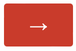
That’s right. It means Go to the next page of the survey.
And that’s all that it should mean!
If you use the right arrow for something else, you will confuse your user, perhaps leading them to enter incorrect information or to neglect to enter information. After all, if you’re going to the next page, you assume that you’ll have the chance to add more information and perhaps even go back to the previous page.
Do not use the right arrow to mean Submit
.
Unfortunately, too many people who build surveys in Qualtrics either (a) don’t understand this basic concept or (b) can’t figure out how to make the button say Submit
. I think it’s more of the latter than the former. I’ve even seen some surveys that say Click the right arrow to submit
, which suggests that the authors know that right arrows aren’t normally used to mean submit
.
Fortunately, once you untangle the Qualtrics user interface, it’s relatively easy to make Submit
buttons.
First, build your survey.
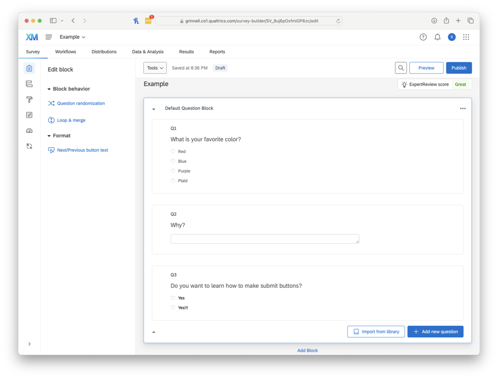
Click on the last (or only) block in your survey. Then click on Next/previous button text
.
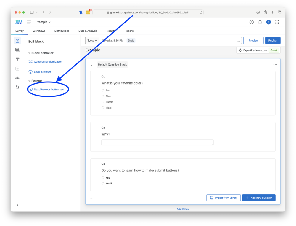
A dialog box will appear. Enter Submit
for the next button text.
Preview your survey.
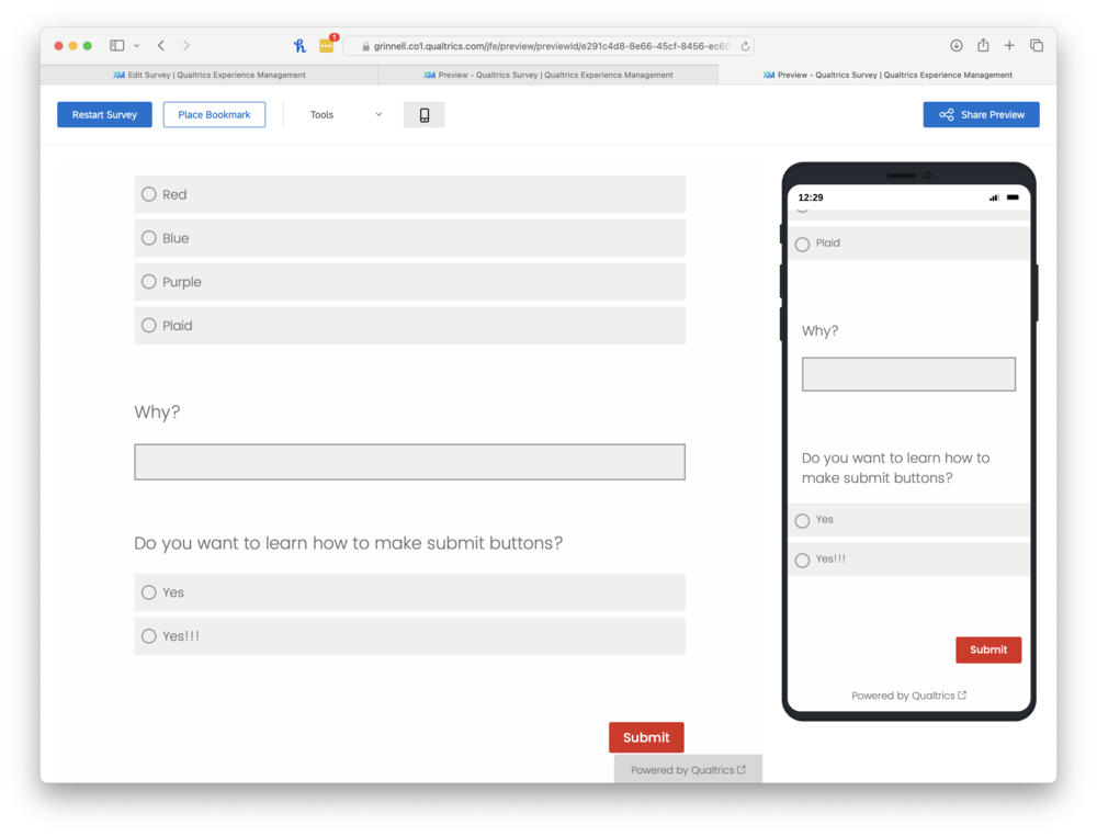
Wasn’t that easy? (No, not if you haven’t been told.)
It only takes a minute to make a Submit button. Spend the time to make your users’ lives easier. You’ll get better data, too.
Thanks!
Postscript: No, I don’t know what symbol to use for Submit
. I agree a symbol might be better, since Submit
is Anglocentric. Perhaps a checkmark?
Postscript: I’m not sure why the folks at Qualtrics did not make Submit
the default for the last block. something something circle of hell reserved for something something Qualtrics UI designers.
Version 1.0 released 2024-04-08.
Version 1.0.2 of 2025-06-13.
The opinions stated herein are those of Samuel A. Rebelsky and do not necessarily reflect those of Grinnell College, Grinnell's Computer Science Department, the Rebelsky family, CMD-IT, SIGCAS, SIGCSE, any other organizations I am or have been affiliated with, or even most other sentient beings.
Check accessibility with WAVE.Copyright © 2016–25 Samuel A. Rebelsky.

SamR's Assorted Musings and Rants: Creating Submit buttons in Qualtrics (#1279)
by Samuel A. Rebelsky is licensed under a Creative Commons Attribution 4.0 International License.
This Web site was built using Markdown, some custom scripts, Twitter Bootstrap, and the Bootswatch Readable Theme.